
Case Study
Channel Thirteen
Website & App Design, UX/UI, Art Direction, Brand Style Guides
THIRTEEN is New York City’s flagship public television station and multimedia public service. I redesigned the channel’s responsive websites and streaming apps for various platforms including AppleTV, Roku, FireTV, iOS, and Android and developed the brand styling used across sites, apps, and social media. A key focus of the project was enhancing search functionality and discoverability, ensuring users could easily find and access content on any device.
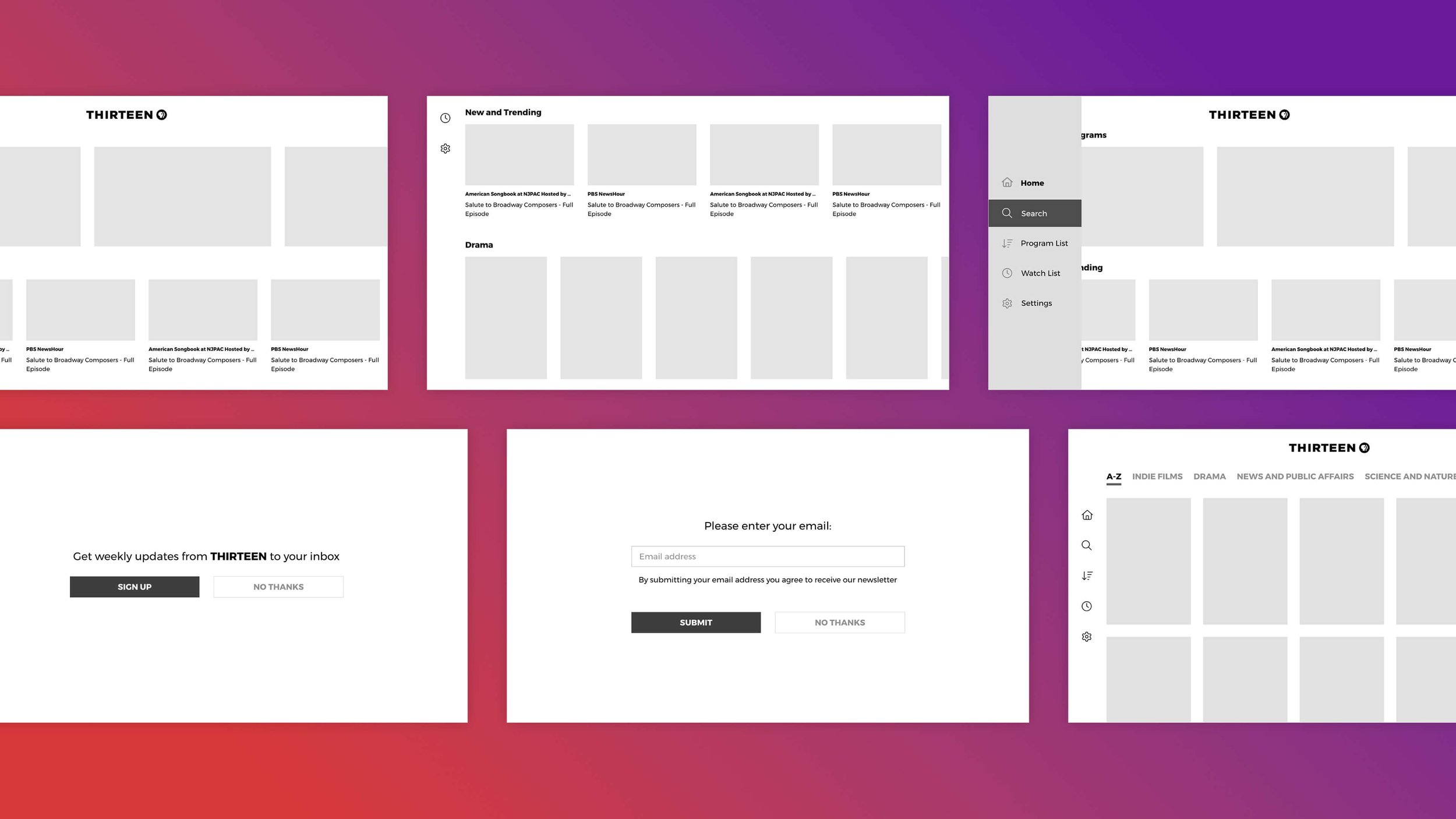
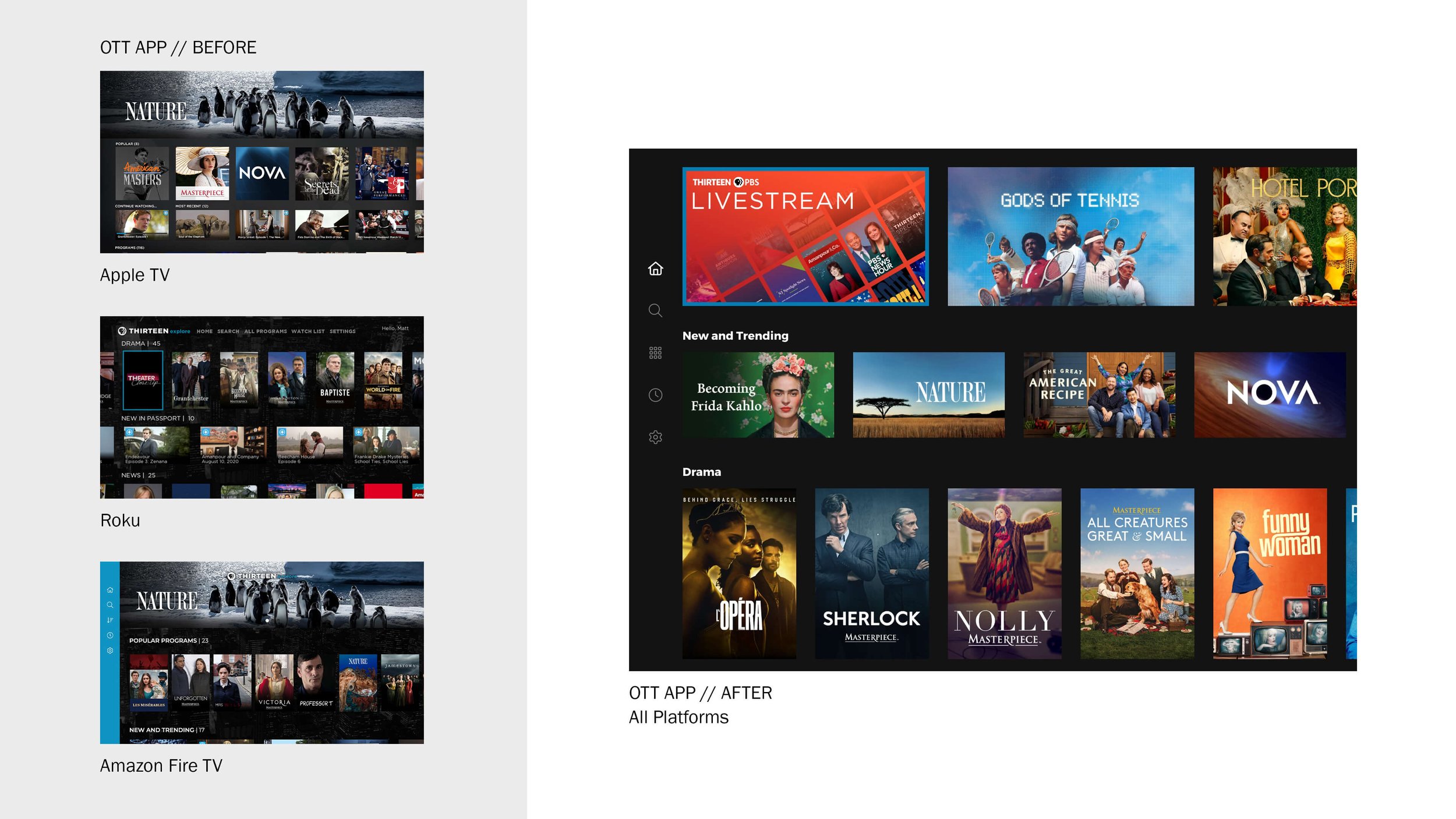
Challenges With The App
With the flagship streaming app, the design lacked cohesion across platforms, causing confusion among users. While custom templates for each platform initially offered some unique design qualities, it ultimately led to a fragmented user experience. As the app evolved, users found the interface inconsistent, and our team faced challenges when rolling out updates across multiple platforms. Additionally, users expressed a desire for more variety and easier navigation within the content library.
The Solution
After many rounds of audits, research, and iterative testing with our team, I delivered an updated, cross-platform experience that enhanced content discoverability and improved the overall user experience.
Streamlined Navigation: Simplified the navigation structure to ensure users could easily find content without unnecessary steps.
Improved Search and Discoverability: Enhanced search functionality through better analysis of available metadata.
Consistency Across Platforms: Developed a unified visual design system that ensured a consistent look and feel across iOS, Android, and web platforms, improving both aesthetic coherence and usability.

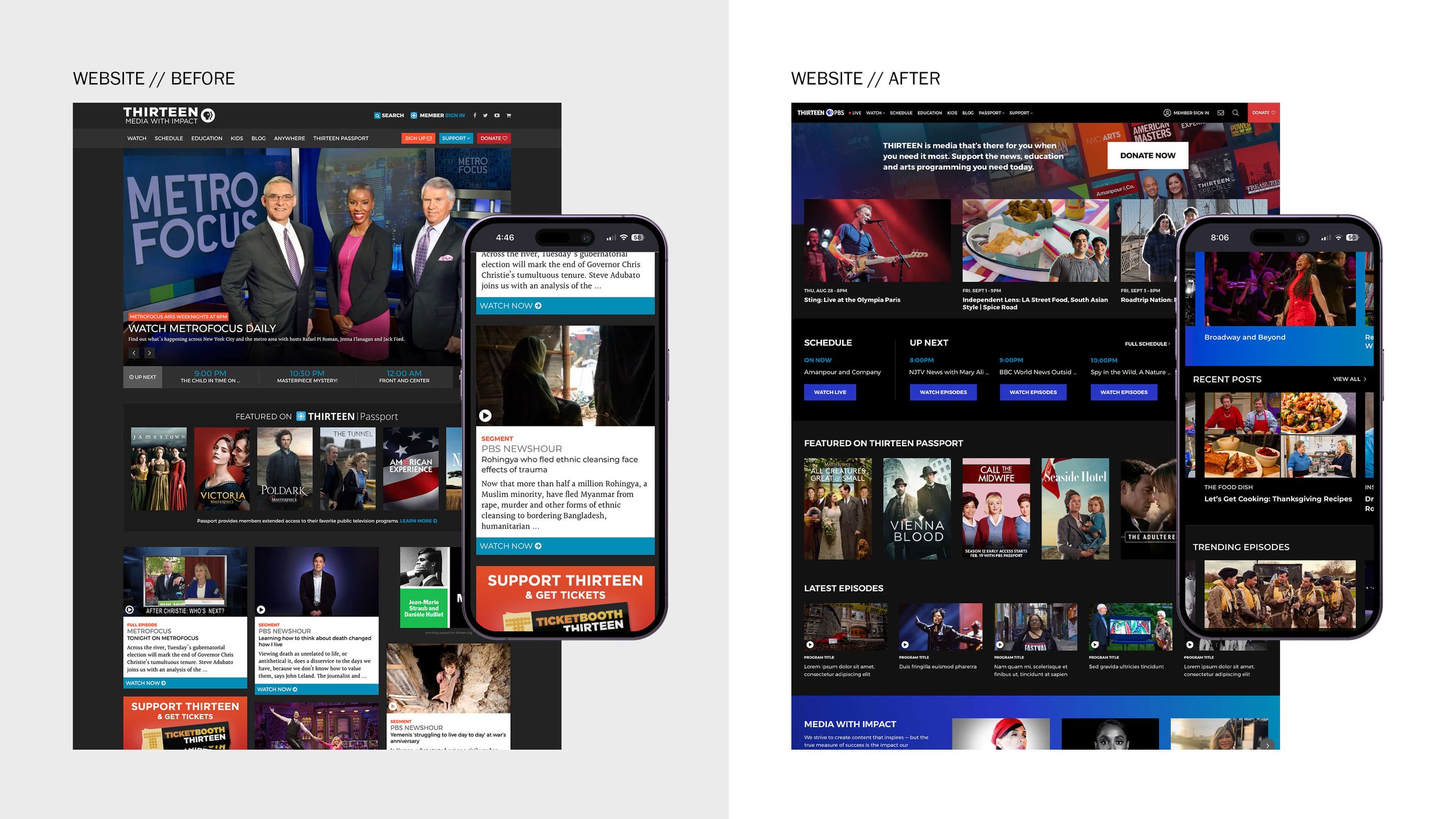
Challenges With The Website
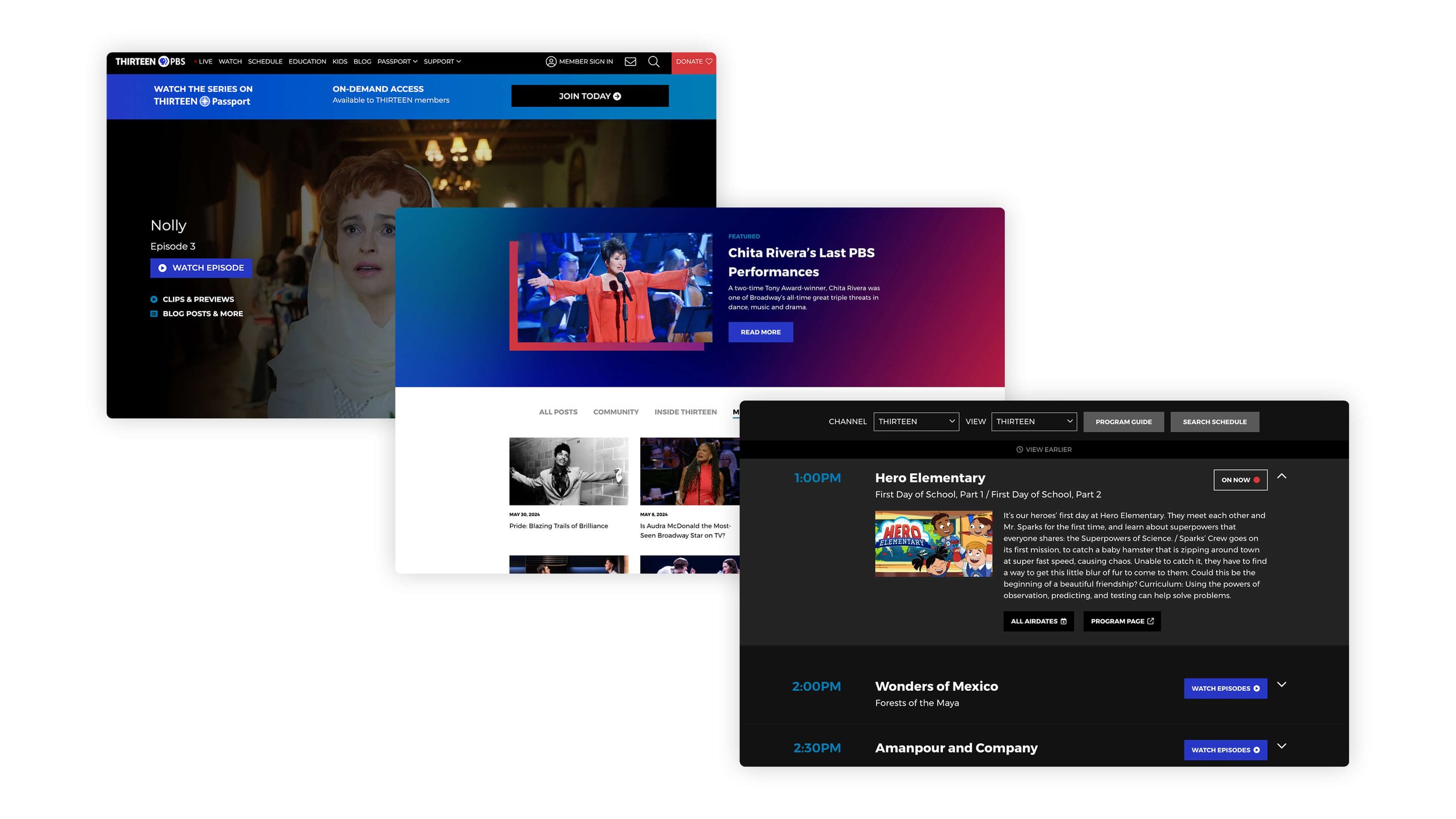
As the volume of station-produced content expanded, the previous website struggled to effectively showcase the growing range of offerings. A more robust content hierarchy and improved organizational structure were needed to enhance the user journey and ensure all content was easily accessible and well-presented.
The Solution
I approached the redesign in iterative phases, prioritizing pages based on their impact. The process began with high-traffic pages such as the homepage and schedule, ensuring foundational improvements were made first.
Mobile-First Design: Ensured a responsive and seamless user experience across devices, optimizing for mobile users first.
Clearer Content Categorization: Organized content into distinct, easily navigable categories, improving clarity and structure.
Increased Content Visibility: Elevated the prominence and accessibility of station-produced video, blog posts, podcasts, and other media, making it easier for users to discover and engage with local stations and the community.